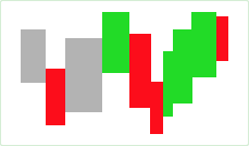
The Equivolume chart consists of rectangle-shaped bars, or "boxes", without gaps between them. The widths of each box is proportional to the volume traded during the aggregation period: the higher the volume, the wider the box. If volume data is not available for the specified symbol, all boxes are plotted having the same width. The top side of each box is drawn at the level of the high price registered on the aggregation period, and the bottom side at the low price level. Equivolume chart does not show the open price, but the close price level can be displayed, if preferred, as a horizontal line in the box.
Incorporating volume into the price data makes it easier to search for confirmation of trend reversals, support and resistance breaks, or buying/selling pressure. The latter is best estimated with the close price display on as multiple studies use its position within the range as an indication of whether the buyers or sellers are in control. Plotting the close price in the Equivolume boxes also serves as a visual reference of trend strength or weakness.
Algorithm
The boxes are filled with the same color as the borderline: the "up-tick" color if close price is greater than the previous close price, or the "down-tick" color if it is less. If these two values are equal, the box is outlined and filled with the "neutral-tick" color.
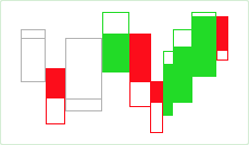
If you choose to display the close price, the boxes will be partially filled: for the up-tick boxes, the system fills the area below the close price; in the down-tick boxes, the area above the close price is filled. Neutral-tick boxes are left unfilled. Note that displaying the close price is enabled by default.
The color scheme of the Equivolume chart can be customized in the Chart Settings dialog. For details, see the Appearance Settings article.
Sample
Equivolume chart:
Equivolume chart with close price:
Default Colors
|
Component |
Dark L&F |
Light L&F |
|---|---|---|
|
Up Tick |
|
|
|
Down Tick |
|
|
|
Neutral Tick |
|
|